Hi there. I’m still here. Trying to keep this little creative space alive. Sawyer is 14 months old now. How long can I use the excuse that I’m a new mom?? 🙂
In all seriousness though, finding the right balance in my roles as wife, mother, dietitian, friend, etc has been particularly challenging. I know I am not alone in this and yet it feels isolating. I’ve been trying to shift some focus to self care since it makes me better in all areas. Part of self care for me is being creative and this blog is a perfect outlet. My desire is to post at least once or twice per month. So dear readers, can you hold me accountable? Can you tell me what you might like to read about or leave questions/comments on things you like (or don’t like)? Even better, tell me about you or share with me your own blog, Pinterest page, or social media. I’d love to follow along.
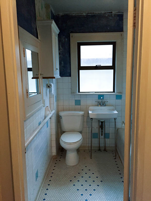
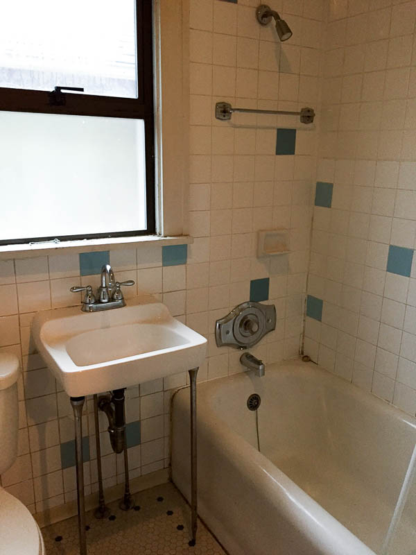
Now on with the bathroom renovation. But first let’s review what we started with. Our house was built in 1924, appears to have had a big renovation in the 60s or 70s and has remained largely untouched since. When we bought the house, my main requirement was that we completely re-do the bathroom since it’s the only one in the house. Truly the bathroom was disgusting. Dark, dingy, and so tiny. We eagerly jumped into demo with big plans and as first time DIY renovation newbies ran into many challenges, both expected and unexpected. My husband truly amazed me by doing most of the work by himself, learning new skills (tile work, plumbing, electrical, window install) and putting in long hours on weekends and after work. Throw into the mix being pregnant and then having a newborn, progress was slow. You can read about part 1 of the renovation in this post.
- Before
- Before
See what I mean? A functional bathroom, perhaps, but in my opinion really not usable. Other than the cast iron tub, we gutted the entire space. We tore down the south wall and framed in a new wall that added 15 inches of space. Justin did all the tile work and I helped (very little) with some of the grouting of the floor. I am not in the least bit handy. Mostly what I am good for is picking out finishes, sanding, and painting, so that’s what I did! Some of my favorite things about the new space are how we added back some of the 1920s charm, especially Justin’s beautiful woodwork. He made all the trim around the window and door as well as the bead board chair rail and base boards. One regret Justin has is using bead board paneling instead of installing individual planks, but it was less costly and required less time to use the panels. I actually loved the original floor in the bathroom but because we expanded the space it could not be saved. It was back breaking work to get it out. We stayed with the hex tile and just updated the look with a black and white design.
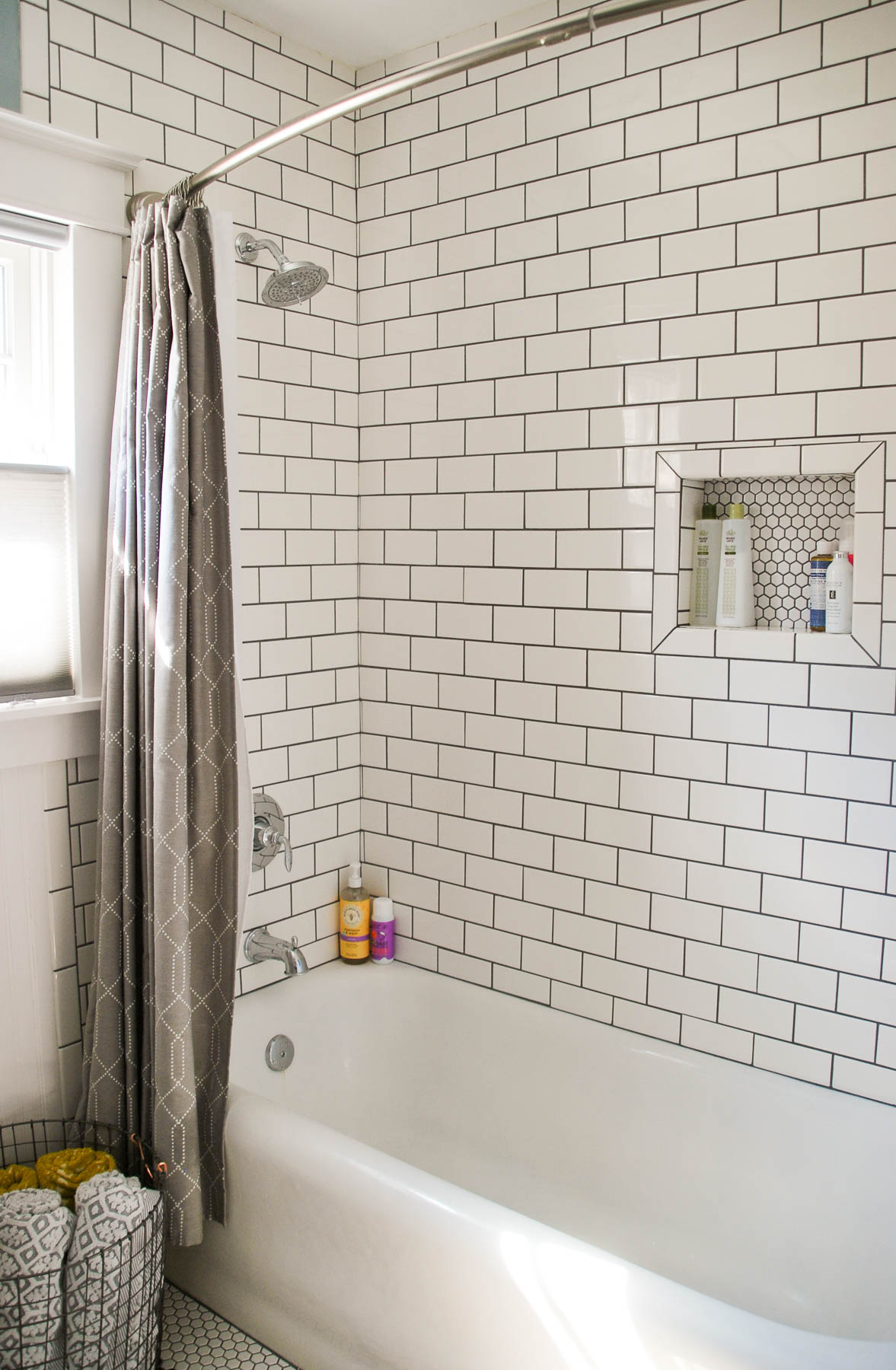
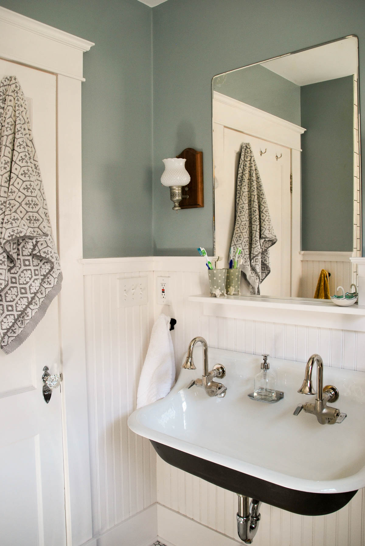
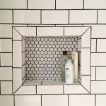
The beautiful door is original but was covered with paneling (why, just why?!) and lead-based paint. Justin found new glass knobs and hardware that matched hardware on another door in the house that looked to be original. Subway tile in the shower felt so classic and taking it up to the ceiling makes the space look bigger. I made Justin’s first tiling job more complicated by asking for a cut out to hold shampoo bottles, but I just adore how it turned out and how the back of the cutout matches the hex tile on the floor. I would have loved the look of two handles on the tub trim, but unfortunately that’s not to Seattle plumbing code due to the risk of scalding.
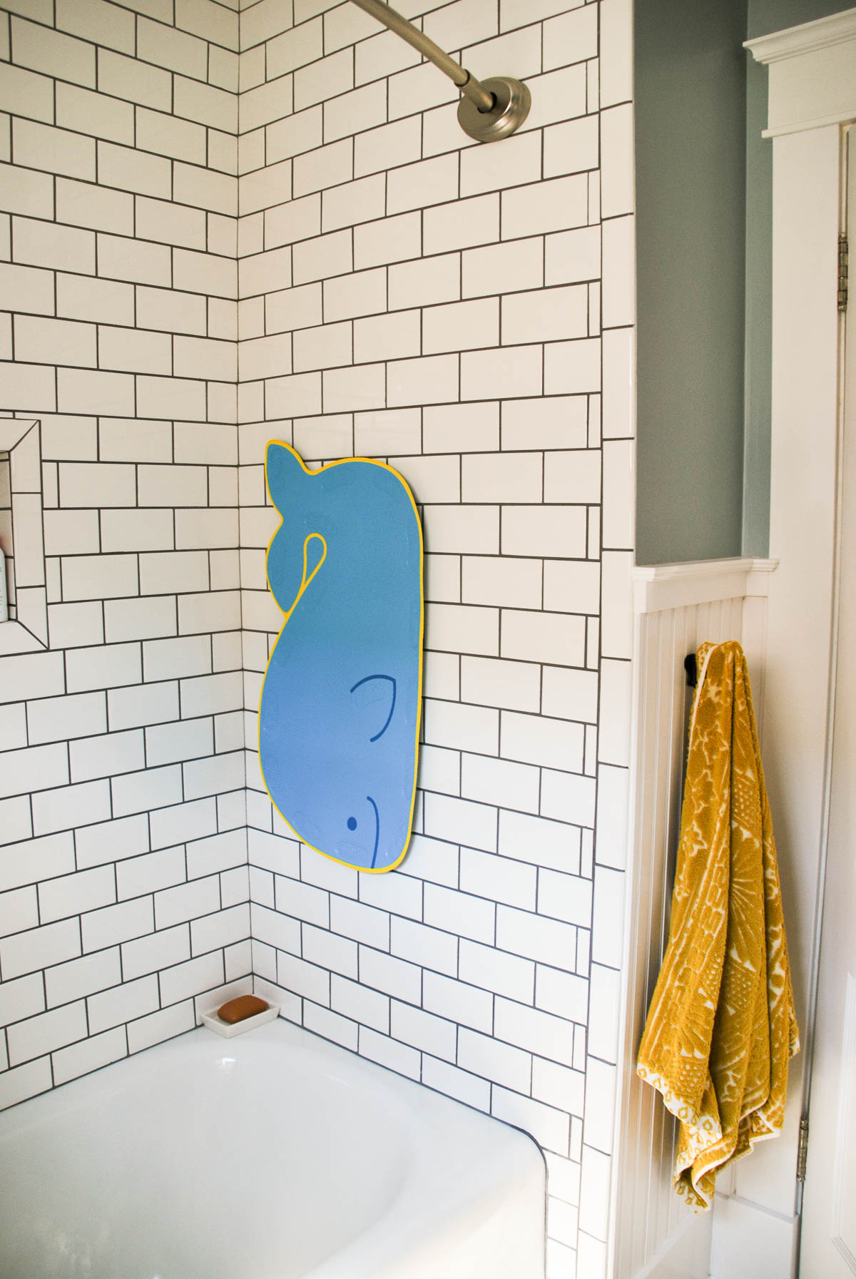
The whale mat hanging on the wall is Sawyer’s for when she takes baths and Justin thought of this cute way of storing it when not in use. Here’s where we could use some advice… that shower rod is an inexpensive tension rod. It looks okay but I think installing a rod with brackets might look better. I had trouble finding ones that didn’t look cheap or out of character with our 1920s vibe. Anyone with a Craftsman home have advice?
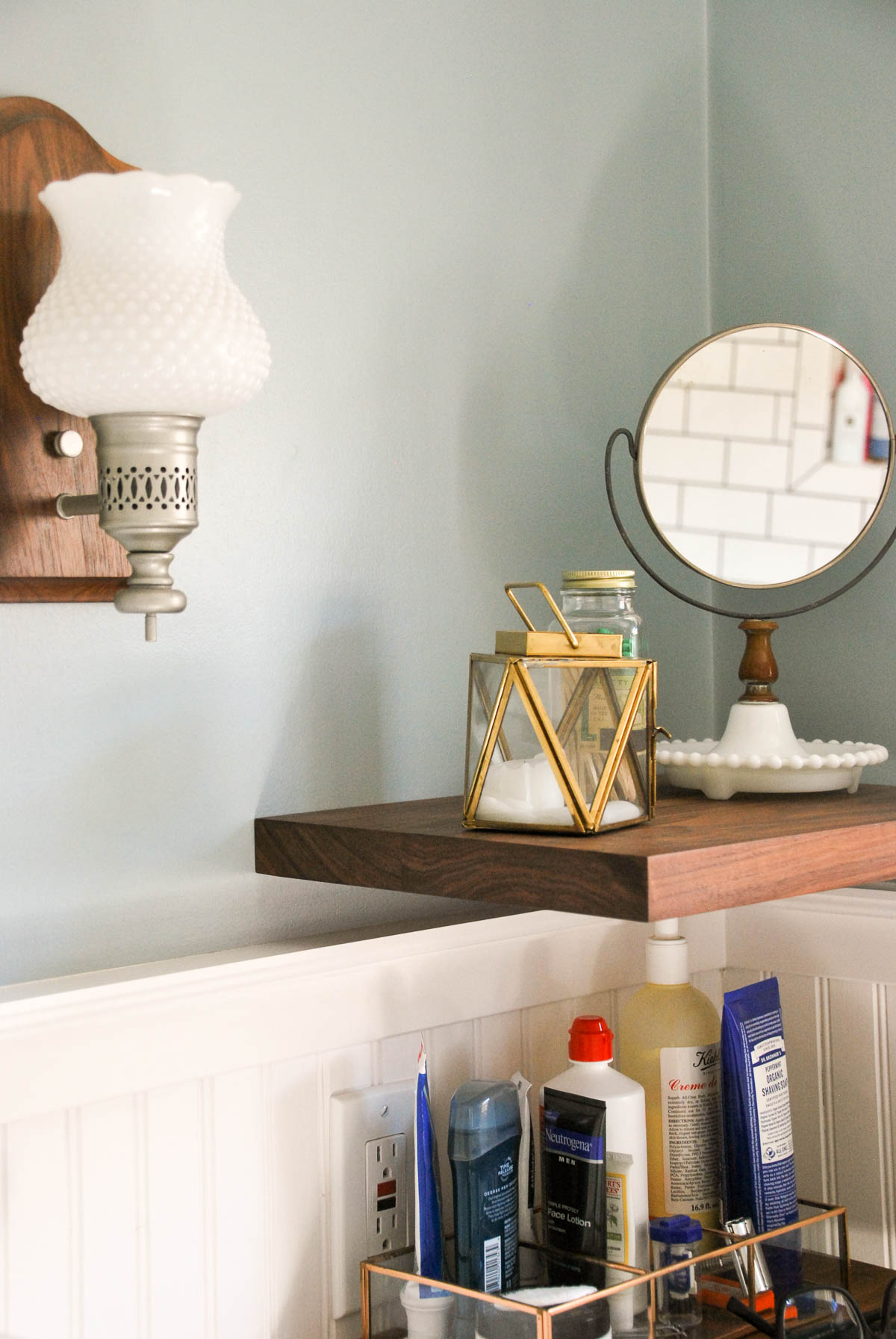
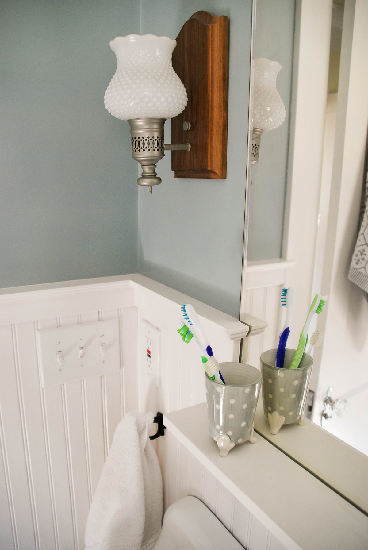
The mirror was one that was left behind by the previous owners and it was hanging in the dining area in a horizontal orientation. Turning it vertical fit the space perfectly and I love the beveled edge to the glass. The milk glass sconces were originally over the fireplace but had an ugly plastic backing that was meant to look like wood. Justin replaced them with beautiful walnut wood and we spray painted the brass light fixture with satin nickel to complement the other finishes in the bathroom.
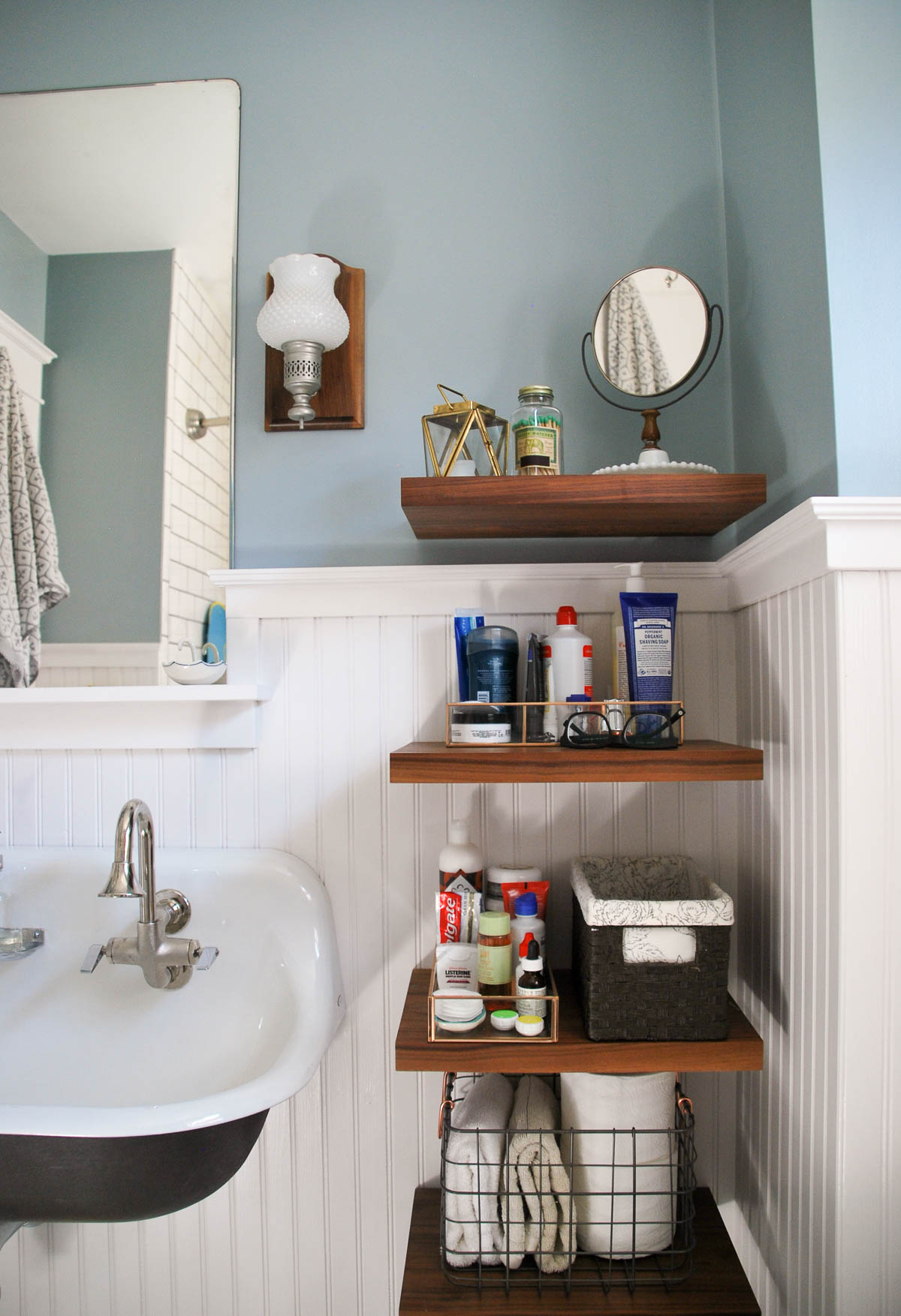
Can we talk about the sink? We’re obsessed. This was our one big splurge in the bathroom and really makes a statement. Since the bathroom is still pretty small, having a sink with no vanity seems to help it feel more spacious. The shelves provide the space to put our toiletries and there’s a linen closet right outside the bathroom for extra storage. Like the sconce backer, the shelves are made from walnut wood. We liked how making them floating kept things from feeling cluttered and added a modern touch.
We are so happy with how this bathroom turned out and hope you like it, too! I’ve listed a few sources for things below, let me know if you have questions.
Sink // Kohler K-3200 Brockway(we used the smallest one but it comes in a few sizes)
Sink Faucets // Kohler
Soap Dish // Kohler (soap dispenser is from Ikea)
Toilet // St. Thomas Creations
Gray bath towel // Anthropologie
Yellow bath towel // Anthropologie (ring dish, tooth brush cup, and candle holder are also from Anthropologie)
Bath mat // Anthropologie
Round wire basket // Target
Glass and metal vanity trays // Target
Milk crate wire basket // Target
Moby whale bath mat // Skip Hop
Shower rod // Target
Tub and Shower Trim// Pfister Avalon 1-Handle (You’ll also need this valve)
Paint colors // Behr Ultra Premium Plus Flint Smoke and New House White from Home Depot (all the tile is from Home Depot, too)





Leave a Reply